End of module evaluation.
I think that this evaluation could be one of the most important summary’s I have made to date to help guide me for my Final Major Project. I’ve been thinking about evaluating my work for the last two weeks. The work that I have produced for hand-in is all right but is lacking that creative spark or cutting edge which I’m after for my portfolio, but this work is finished now, and it is important to identify where the projects have lacked good design to prepare better for my FMP.
I think that over the summer I found and made ten briefs that I thought would be good for me to answer but quite a few of the briefs lacked clarity and a list of deliverables. When I started them I worked round in circles, running around without taking time to think what I was actually doing. The briefs I shall choose for my FMP will be well put together and have enough clarity and depth so that I can keep focused more for how I answer the brief. I have already wrote three over the last 2 weeks which I can’t wait to start. I think that I need to be productive with my time rather than busy.
Also I think I rushed to try and get four projects together and through this I missed out the design ideas rather than sitting down and taking time to stop and think to evaluate my work and enjoy my work again.
This evaluation might be negative but I want to be proud of the work I produced and I think the last few months work isn’t bad but it’s my turn, as a third year and I want work to be proud of, and show a creative spark within my work. I’m so glad that I’ve done these briefs because I’ve learnt an awful lot and its put me out of my comfort zone and I’m confident from doing these briefs and learning about my own design practice my FMP will be a strong finish to my degree.
Tuesday 13 December 2011
Monday 12 December 2011
Thursday 8 December 2011
Wednesday 7 December 2011
Boards for Thursday
Need to:
- Add text and explanations
- Print off B&W and stick together
- Add Coors Adverts
- Add samples for Fedrigoni
Saturday replace images with clearer photos
Second round of photos
Still the colours are dark and yellow so on Saturday I shall use the photography equipment and replace the Final crit boards with the same compositions but clearer photographs
Friday 2 December 2011
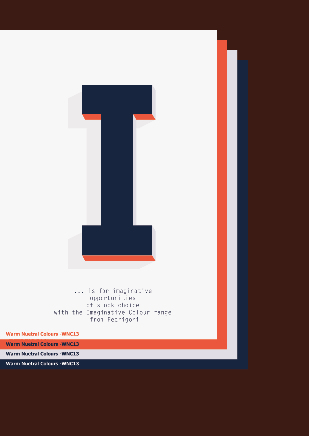
Development of Identity
Trying to use the word I to tell a story of the product using 4 layers of stock
So far

Magazine Advert and poster, The rest of the range would be layout pad, website ... mail-shot to be sent to existing customers.
Development
Simplifying the Message to communicate with the audience. The dropped stock technique has had to be changed due to the appearance of the letter in the middle.
Thursday 1 December 2011
Re-consider...
After talking to Joe about my work today there were a few things to consider:
- Typeface use colour
- Use digital as well as photographs
- The concept for fedrigoni is strong but I could do with simplifying the words used for fedrigoni and how to spread the content out over 4 pages to tell a story.
- Typeface use colour
- Use digital as well as photographs
- The concept for fedrigoni is strong but I could do with simplifying the words used for fedrigoni and how to spread the content out over 4 pages to tell a story.
Thinking of the range- Layout pads
Would layout pads run with the campaign I am creating? how can the stock layers work with the layout pad?
Thinking how the concept would work for Magazine adverts
Need to think how the pages would be interacted and also the format of the advert
Subscribe to:
Posts (Atom)