Monday 31 October 2011
Final range of four bottles
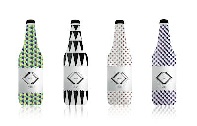
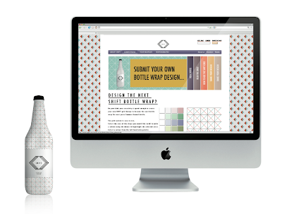
Final four bottles I have chosen to be the same product but a range of different designs. I think the bottles will need to be rendered better, to add more depth and give it a more alcoholic feel.
Bottle Development
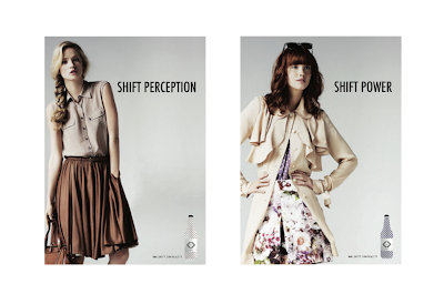
Creating bottle wraps influenced by the female persona with the logo on. I think it is important not to make the bottle look and feel to masculine and not to feminine, if it was to masculine it would not solve the brief as there are already male targeted beers on the market and to feminine it would look too much and females would be to embarrassed to be seen with it.
Grid System - Fashion Patterns
The grid I have created will be used to design patterns based around the current female persona trends regarding shapes and colours.
Final Logo
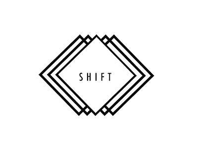
The final tweaked logo for Shift lager.
The logo represents the movement of the brand and the play on the language, shift power, attitude, perception. I think the bold squares guarding the word shift in the centre almost protects it and reflects the target audience as a safe product/ brand.
The typography is heavily influenced from the research into the female persona I am creating the brand for. Tall thin type
Logo Development.
Relating to the brand name SHIFT. The logo is based around the idea of movement but also using the bold shapes used relating to the female personas fashion patterns.
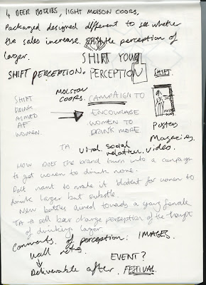
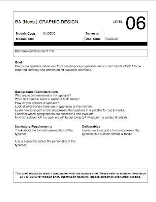
PDF of notes and thoughts of the brief
Graphic Language from T.A magazines
Dazed & confused
vortex
soul
your drink, your way
In havana - culture
When you cant find a party. You throw one.
Wove/n.
Rough & ready
feist
ol'
point
lost
equals
zips
hogan
dazed
shape & shift
shift
radical
entwined
cut & paste
wet & wild
all screwed up
vortex
soul
your drink, your way
In havana - culture
When you cant find a party. You throw one.
Wove/n.
Rough & ready
feist
ol'
point
lost
equals
zips
hogan
dazed
shape & shift
shift
radical
entwined
cut & paste
wet & wild
all screwed up
What makes the product unique?
Culture
flavour
calories
bitter
themed:
seasonal
festival
fashion
social drink
Look at , perfume packaging
PAPER London
Costa- Coffee
Lord of the files
WIlliam Golding
-Patterns
-Typography
-Language
-Colours
-Antique
-Penguin books
-YCN type
flavour
calories
bitter
themed:
seasonal
festival
fashion
social drink
Look at , perfume packaging
PAPER London
Costa- Coffee
Lord of the files
WIlliam Golding
-Patterns
-Typography
-Language
-Colours
-Antique
-Penguin books
-YCN type
Audience
Product modern, sleek
create a sense of culture
young- 18-25
festivals
umbrellas
tents, wellies
food? fruit
Social
Networking mobile
students
topshop , red magazine
music interest- alternative
to look different
drives/ cycles
what magazines does she like
looks after herself
well cultured
vintage
strong person
sophisticated
cautious, world & food
Finding an audience
What age range are more likely to drink beer
18-25
25-35
Young Parents
Mature audience set in wine and tea
Bottle-Message
What mood?
Persona Characteristics
Socialise
Internet
college/university
work
home
Fashion, whats in
Mobile - whats apps
small cars
work 9-5
local
friends
nights out
concerts
clubs bars
categories
news
stars
style
fashion
beauty
horoscopes
decamel
Moodboards
Audience
Compare two different subjects
Existing drinks
Trends
Promotional Campaigns for alcohol
VK, wine, Malibu, Ameretto, Bacardi
Opposite of Bitter
Compare two different subjects
Existing drinks
Trends
Promotional Campaigns for alcohol
VK, wine, Malibu, Ameretto, Bacardi
Opposite of Bitter
Audience
Women who buy alcohol
18-60 (big audience)
Why not buy beer?
Too masculine in the look and taste
what alcoholic beer would they like?
Language and trends present
Light ale - interact
Women taste bitter more than men
18-60 (big audience)
Why not buy beer?
Too masculine in the look and taste
what alcoholic beer would they like?
Language and trends present
Light ale - interact
Women taste bitter more than men
Problem
WHY IS THERE "A MASSIVE GAP IN THE MARKET, FOR BEER TO BE AIMED TO WOMEN"
If I can understand this then I will aim to create a response based on my findings.
If I can understand this then I will aim to create a response based on my findings.
Problem
What do women drink?
Why do they drink a certain drink?
What beers/ drinks are already targeted at Females? & How?
Are they successful, why?
What other products are consumed more by males & what alternatives are aimed at females? Shavers
When & where would the drink be consumed?
What category of drink would appeal to women? calories, flavour...
Is it a range of flavours, more than one product.
What products already exist at Molson Coors?
What person would the drink be aimed at?
How does the product engage the audience to the drink?
Distribution?
Market/ Promote?
What language is used- Audience?
Deliverables
-Invent a name for the brand/ campaign
-Logo
-Graphic Language
-Range... Website, Info packs
-What does the brand sound like?
-Interaction?
-Where would the product be aimed/ found?
Molson Coors
Brief
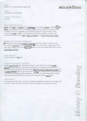
Name and create an identity for a campaign to encourage women to drink more beer
Background & Creative Considerations
There is a massive gap in the beer/lager market in terms of engaging women who have traditionally been seen as wine/spirit drinkers.
Target Audience
Female Drinkers of all ages
Requirements
Create moodboards to form a clear direction of what female persona you are going to create the brand for. Invent a name for the brand, a logo and a graphic language to be used across a range of different medias.
Thursday 20 October 2011
Distribution
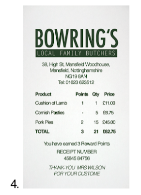
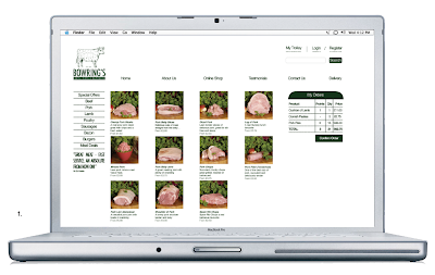
1. Ideal to order using the inmternet for collection in the same process as the iphone
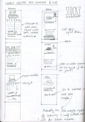
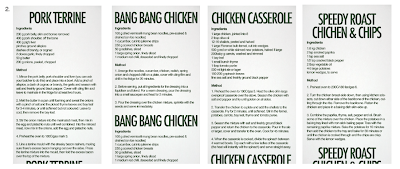
2. Four different backs of till rolls, with recipes on
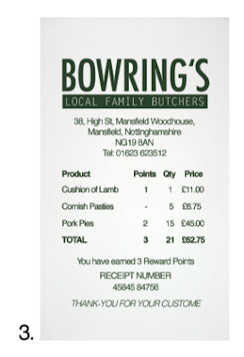
3. Normal reciept for any customer
4. When an order is placed a reciept with the customers name is printed. This is good for organization but also adds that personal experience value which supermarkets cant do instore.
Order Process
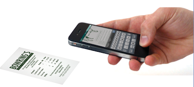
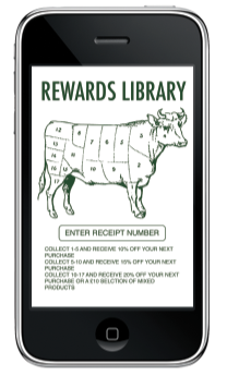

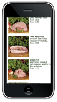
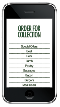
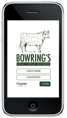
Mock up of an app for the butchers ideal to place orders within workers lunchtime for a collection at a spersific time. (after work when commuting through town on the way home)
One of the problems was the waiting times and closing times at local butchers vs supermarkets, this idea will make it easy to order and collect on the same everyday journey
travelling home.
When the order is placed the receipt will be printed at the butchers with the customers name on. This will be good for the user experience and makes it more personal, but also
helps organise the time frame for collection.
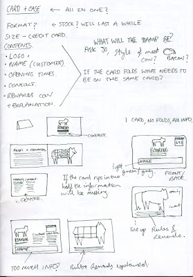
The app also has a Rewards Library where the user collects tockens when purchasing products which colour in the cow Logo part by part until enough parts are coloured to
claim a discount.
Final three typefaces
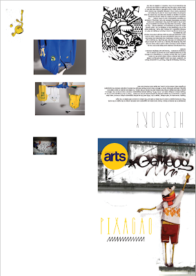
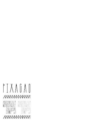
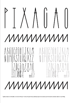 Typeface based on the Brazilian art movement Pixacao. The idea of long thin sharp pinted light approach was based upon the research undertaken stated on my DC Blog.
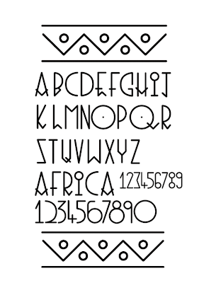 Typeface based on Kenyan Symbolic mark making. I will use a similar style background to represent the patterns of Kenya so both relate.
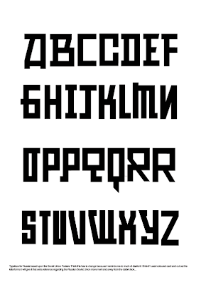
Typeface for Russia based upon the Soviet Union Posters. Think this has to change because it reminds me to much of danfont. I think if I used coloured card and cut out the
letterforms it will give it that extra reference regarding the Russian Soviet Union movement and away from the dafont look...
Russia Calendar Development
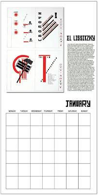 Quick mock up of the Calender using my own type & colour
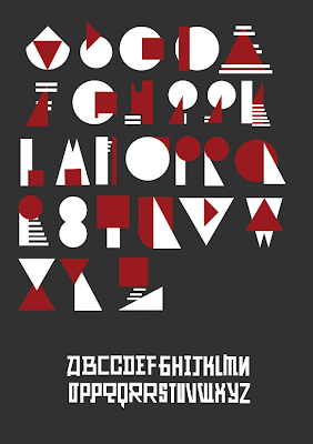 Thinking of using two typefaces. One to be used more for the image and the second a direct bold simple typeface to be used for the heading with another typeface for the body text. The top Typeface is influenced from Lissitzky, I will try to print the type and cut it out with card to give it that traditional look and moves away from the dafont look.
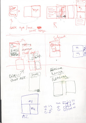
 Layout ideas for the front cover of the computer arts magazine. This will be cut from card to give it the traditional look.
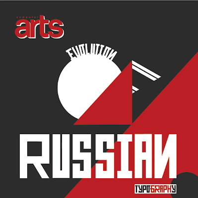
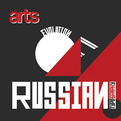 OI think the graph word breaks up typography and relates to the guides used within the constructivist movement
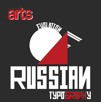
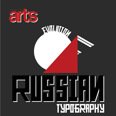
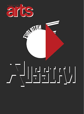

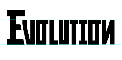
Typeface to be used with image, it will support the image because its stands out bold and makes it easier to read.
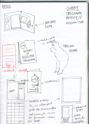
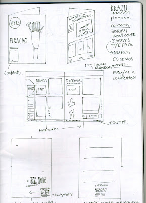
Ideas for contexts - Brazil/ Russia
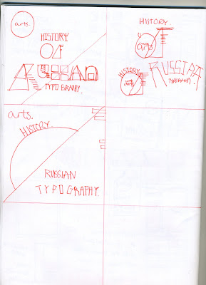
 Ideas for new typeface to be used next to the previous one produced
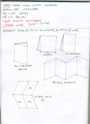 If im producing three publications, I think it would be good to explore different layouts which can relate to the art movements more than just the standard A4 layout.
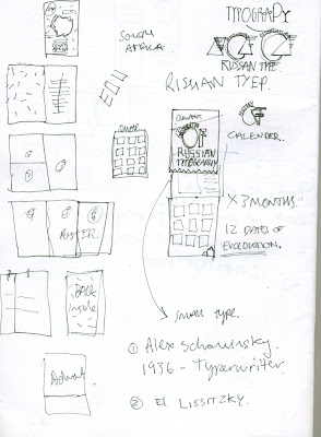
 A few keys dates within the history of Russian typography.
Thursday 13 October 2011
Purpose for the app
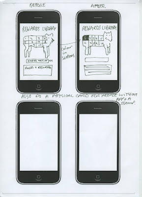

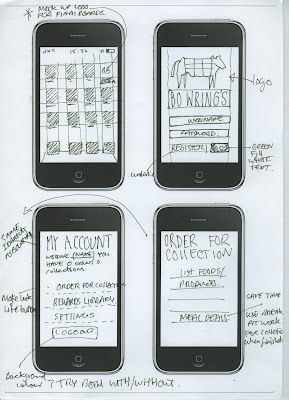 The app will be ideal for city commuters to order at work in the day or on their lunch break, to order a meal deal for the night or select products to be picked up at certain times, this will result into a shorter queuing time, beware of the opening times so they have chance to collect before the shop shuts, and also redeem points with a reward scheme built in with every order resulting to a collection for discounts when used in later dates. The app is for a long term audience. Their will also be a traditional card variation of the apps reward library as not everyone has smart phones.
Subscribe to:
Posts (Atom)
