End of module evaluation.
I think that this evaluation could be one of the most important summary’s I have made to date to help guide me for my Final Major Project. I’ve been thinking about evaluating my work for the last two weeks. The work that I have produced for hand-in is all right but is lacking that creative spark or cutting edge which I’m after for my portfolio, but this work is finished now, and it is important to identify where the projects have lacked good design to prepare better for my FMP.
I think that over the summer I found and made ten briefs that I thought would be good for me to answer but quite a few of the briefs lacked clarity and a list of deliverables. When I started them I worked round in circles, running around without taking time to think what I was actually doing. The briefs I shall choose for my FMP will be well put together and have enough clarity and depth so that I can keep focused more for how I answer the brief. I have already wrote three over the last 2 weeks which I can’t wait to start. I think that I need to be productive with my time rather than busy.
Also I think I rushed to try and get four projects together and through this I missed out the design ideas rather than sitting down and taking time to stop and think to evaluate my work and enjoy my work again.
This evaluation might be negative but I want to be proud of the work I produced and I think the last few months work isn’t bad but it’s my turn, as a third year and I want work to be proud of, and show a creative spark within my work. I’m so glad that I’ve done these briefs because I’ve learnt an awful lot and its put me out of my comfort zone and I’m confident from doing these briefs and learning about my own design practice my FMP will be a strong finish to my degree.
Tuesday 13 December 2011
Monday 12 December 2011
Thursday 8 December 2011
Wednesday 7 December 2011
Boards for Thursday
Need to:
- Add text and explanations
- Print off B&W and stick together
- Add Coors Adverts
- Add samples for Fedrigoni
Saturday replace images with clearer photos
Second round of photos
Still the colours are dark and yellow so on Saturday I shall use the photography equipment and replace the Final crit boards with the same compositions but clearer photographs
Friday 2 December 2011
Development of Identity
Trying to use the word I to tell a story of the product using 4 layers of stock
So far
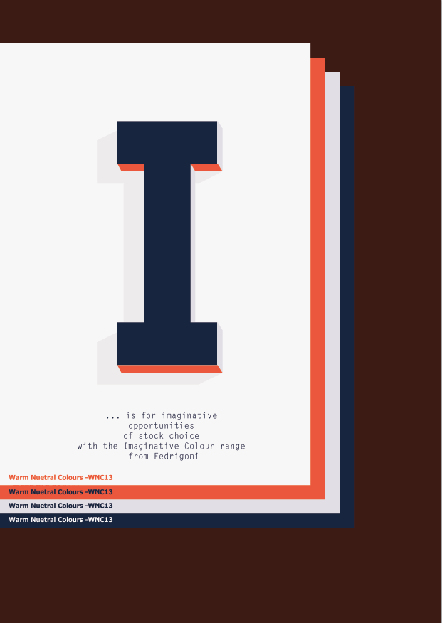

Magazine Advert and poster, The rest of the range would be layout pad, website ... mail-shot to be sent to existing customers.
Development
Simplifying the Message to communicate with the audience. The dropped stock technique has had to be changed due to the appearance of the letter in the middle.
Thursday 1 December 2011
Re-consider...
After talking to Joe about my work today there were a few things to consider:
- Typeface use colour
- Use digital as well as photographs
- The concept for fedrigoni is strong but I could do with simplifying the words used for fedrigoni and how to spread the content out over 4 pages to tell a story.
- Typeface use colour
- Use digital as well as photographs
- The concept for fedrigoni is strong but I could do with simplifying the words used for fedrigoni and how to spread the content out over 4 pages to tell a story.
Thinking of the range- Layout pads
Would layout pads run with the campaign I am creating? how can the stock layers work with the layout pad?
Thinking how the concept would work for Magazine adverts
Need to think how the pages would be interacted and also the format of the advert
Wednesday 30 November 2011
Targets for the day
Wednesday
Coors logo - bigger
coors bottle shape
stationary
Ideas for photoshoot
Finish dancehall pioneers book
Fedrigoni
Posters make illustrator & photoshop layers
layout pads & swatches
Pencils
Mailshots for invite
Magazine layout
Cups
Shirts
Coors logo - bigger
coors bottle shape
stationary
Ideas for photoshoot
Finish dancehall pioneers book
Fedrigoni
Posters make illustrator & photoshop layers
layout pads & swatches
Pencils
Mailshots for invite
Magazine layout
Cups
Shirts
Tuesday 29 November 2011
Different Format
trying a different format 7-inch record Ideal to create a cover to go round the book as well.
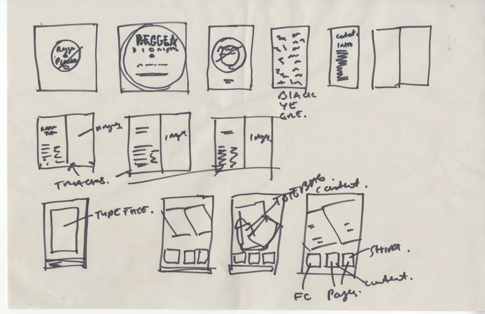
Mock up of the book so far
Need to work on the cover and contents page asap. I think I need to try using traditional materials for the cover to give it that 80's dancehall authentic feel.
Spread design for typeface in Contexts
Trying out different layout ideas to put the dancehall pioneers book into context by using the Property typeface.
However i'm not to happy with the contents page so I shall go to the library to look for some more inspiration.
Monday 28 November 2011
To do list
Tuesday
am
- Mock up Dancehall pioneers book - Design
pm
-print and make book
-print type spec onto tracing paper
Wednesday
am
-Produce range for coors
pm
-produce range for fedrigoni
Thursday
finalize coors and fedrigoni for print.
Photos of products
Friday put boards together
am
- Mock up Dancehall pioneers book - Design
pm
-print and make book
-print type spec onto tracing paper
Wednesday
am
-Produce range for coors
pm
-produce range for fedrigoni
Thursday
finalize coors and fedrigoni for print.
Photos of products
Friday put boards together
Saturday 26 November 2011
Illustrating the swatch guide
After a Clean information graphics looks with strong type & layout with the use of coloured stock to reflect the imaginative colours.
Ideas for type to be used in context
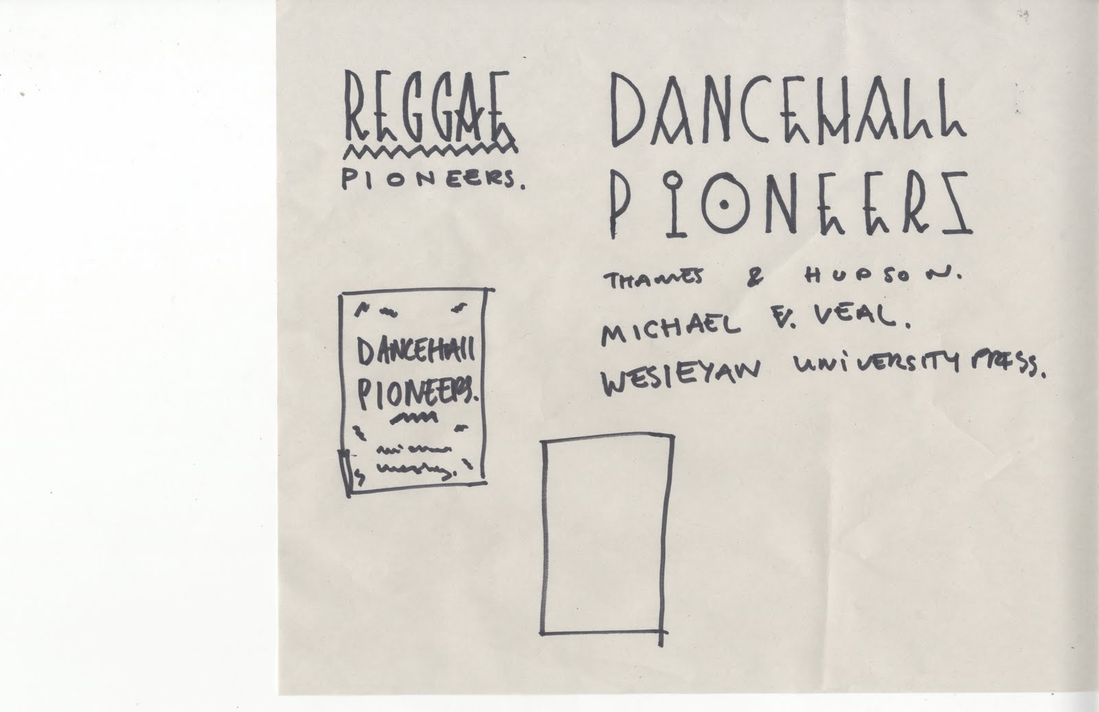
I have been scribbling random words and names with the typeface but a subject I like is Reggae Dancehall, as the influence of the typeface fits the subject. I shall mock up a few pages of a publication best on Dancehall pioneers to show the typeface in context. Above are a few sketches of ideas of the cover and inside layout.
Wednesday 23 November 2011
Look Book ready for Print
Today I printed the look book, the stock and margins turned out nice and gives the typeface the authentic look of the origin of the typeface.
Background/ Wallpaper
Just experimenting with the typeface to create a wallpaper or wrap for the David Rodigan shirt, I have exposed on screen ready to print. Maybe a hand-drawn version of the typeface could work well
Texture
From looking at the publication for the typespec look book on screen the white background looks to clean and doesn't communicate the typeface I have created which has been influenced by African painted symbols. The front cover will be a strong weight so that the look book isn't weak and bends as soon as its picked up, but the only card to print on is white within the print studio. I have scanned in some newsprint to give it a more original feel.
Thursday 17 November 2011
Wednesday 16 November 2011
Range of Promotion
If I was to use a tote bag it would be white or at least whiter than the bag used above. The layout of 9 characters horizontal works really well to fit the layout of the bag & shirt. I am happy I've found a layout that I like for the products it will just be selecting the colours depending on what colour tote bag I can buy. After playing with the colour schemes I am interested in what Colours I could use for the look book and also what stock to use.
Colour & Stock
The lookbook is almost finalised, however I need to add a page of mock ups of the typeface being used in context, African Sculpture Park event. Also I need to produce some promotional material for the typeface.
PDF - Look book progress
The layouts works well but I dont think the colours work well. The low opacity type on the inside cover doesnt look right, so Ill try without the type
Cover Development
Could do with considering the stock and colours. I think the layout and compositions are good but it could look out of place by using the wrong stock to be printed on. Maybe experiment a few ideas with stock and maybe look into making the manual more interactive.
Tuesday 15 November 2011
Friday 11 November 2011

Wednesday 9 November 2011

Target Audience
Understanding who I am designing for is important to gain a concept to base a series of three posters around.
Dance Lovers
All walks of life
Electronic Music
21 this year
Pioneering Iconic
Experience
18-30
Tuesday 8 November 2011
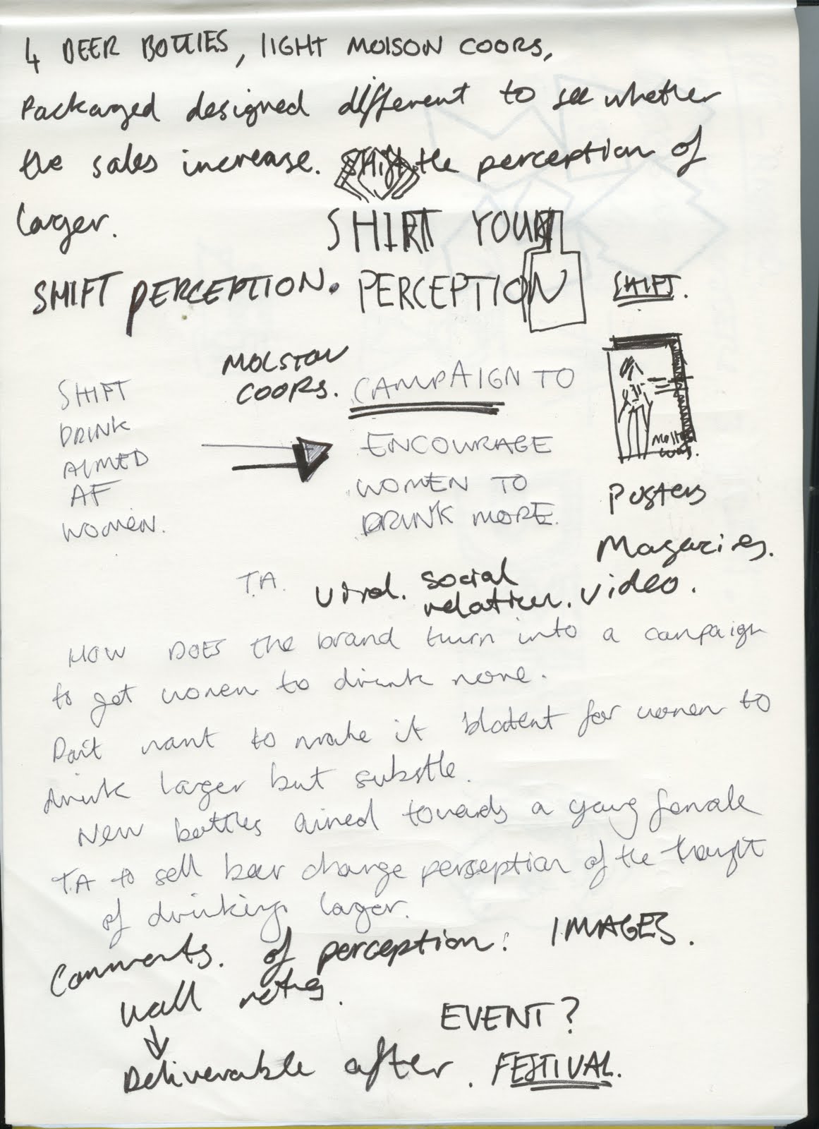
Campaign development

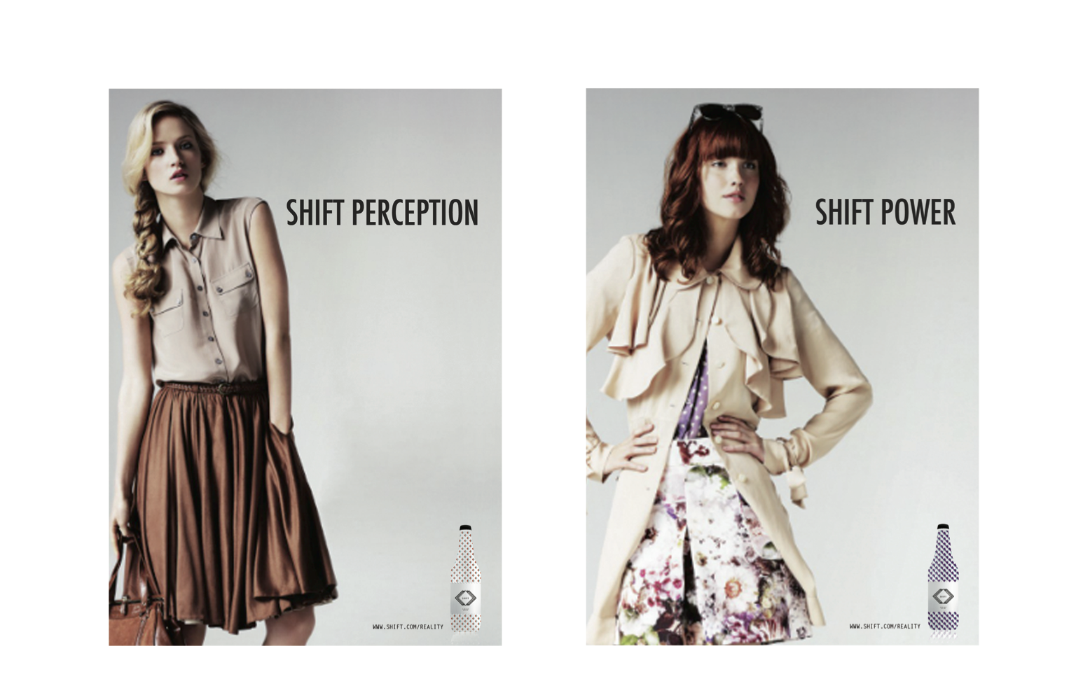
 Need to find a way to promote the bottle to the audience, above is very bland. Should refer back to advertisements in womens magazines as influence.
New range of bottles
 I think the new logo works a lot better for the bottle wraps as it brings out the colours and help communicate to my Target audience better than the strong looking bottles previously.
New Developed Logo
 From the last progress crit, It was recommended by Ailsa to change the logo to make it appeal to the target audience more by adding the name Coors, This was because `shift on its own sounded to strong for the audience.
What I need to Do.
Coors for women
Make the bottles work as a set and more feminine colours
Produce a range of deliverables
Language Used
Posters without women, maybe a questionnaire
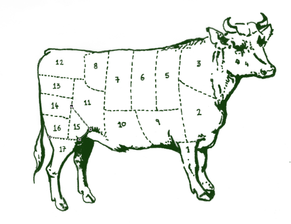
Butchers
Develop logo
Packaging, eggs, sausages and ham- plastic bag and labels/ stickers.
Typography
Create typeface for set of pioneers books
Layout Ideas for Pioneers
Content for pioneers
Range for pioneers
Work across ipad, how can it be interactive
Identify D&ad Brief
What do I want to gain from it...
Make the bottles work as a set and more feminine colours
Produce a range of deliverables
Language Used
Posters without women, maybe a questionnaire
Butchers
Develop logo
Packaging, eggs, sausages and ham- plastic bag and labels/ stickers.
Typography
Create typeface for set of pioneers books
Layout Ideas for Pioneers
Content for pioneers
Range for pioneers
Work across ipad, how can it be interactive
Identify D&ad Brief
What do I want to gain from it...
Thursday 3 November 2011
Wednesday 2 November 2011
Example of the concept in Photoshop
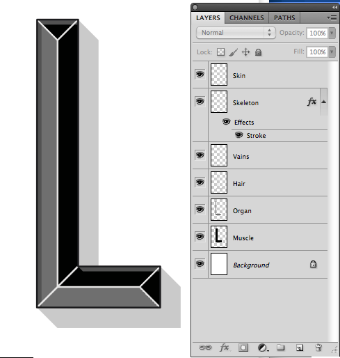
Layers on the side relating to the different fonts in the typeface family. The typeface will be good to adapt colours, prints anything you want to make it creative.
Font Family
Hair - Drop Shadow
Skin - Outline
Vains - Inner Drop Shadow
Muscle - Base of the Letter - Fill
Organs - Emboss
Skeleton Middle of the Letterform
Skin - Outline
Vains - Inner Drop Shadow
Muscle - Base of the Letter - Fill
Organs - Emboss
Skeleton Middle of the Letterform
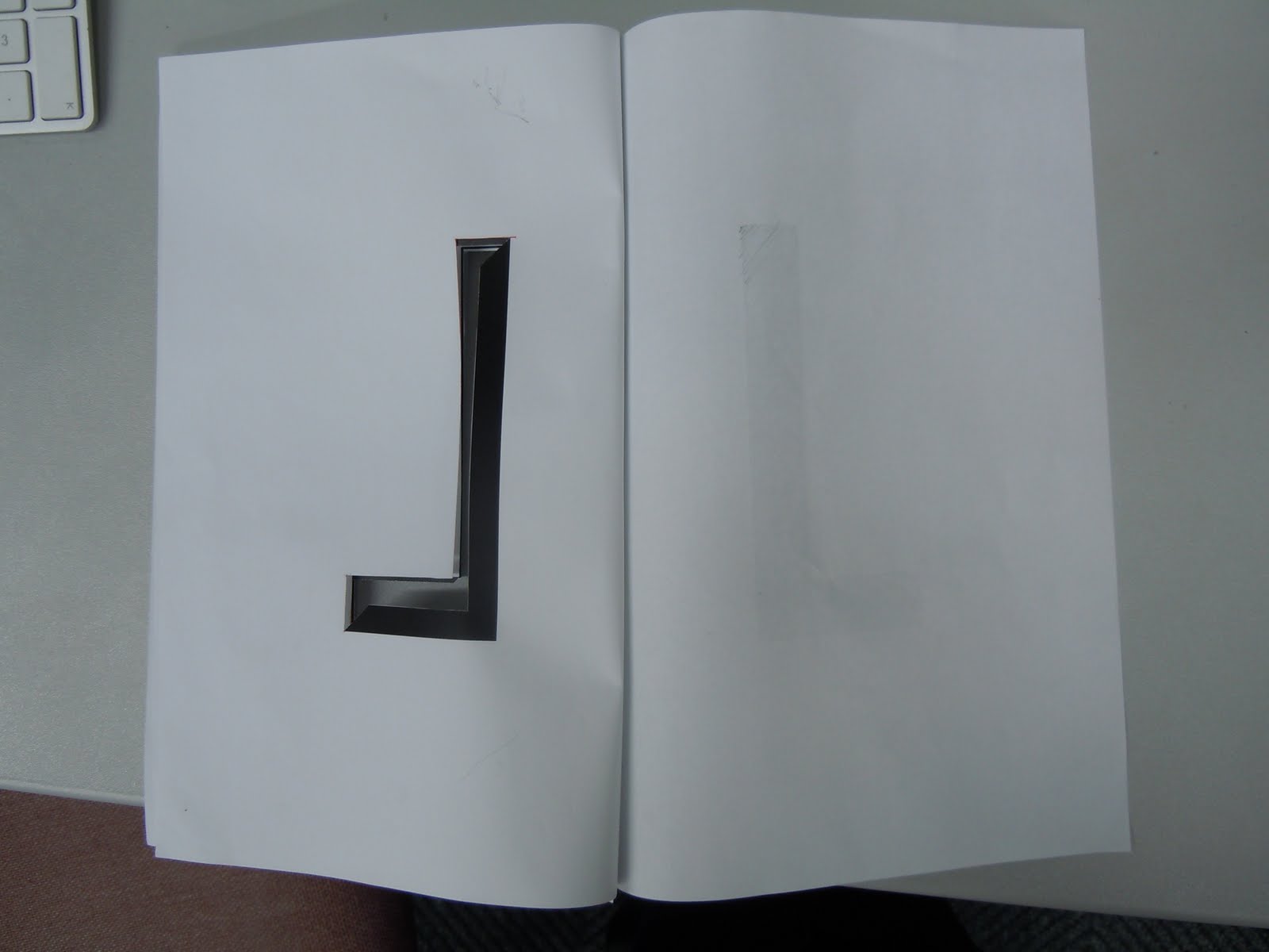
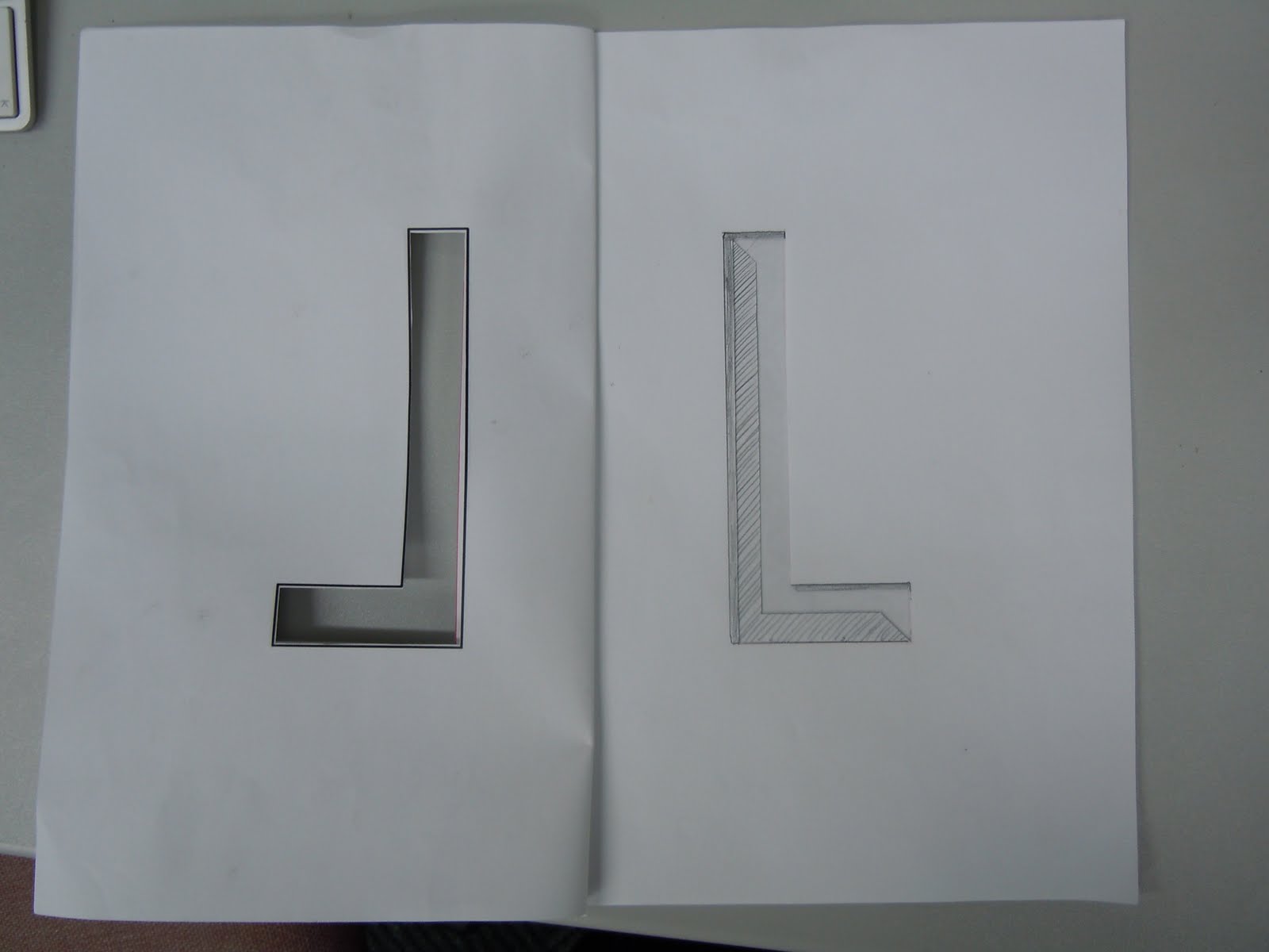
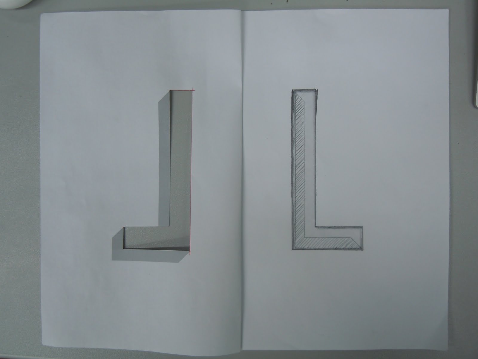
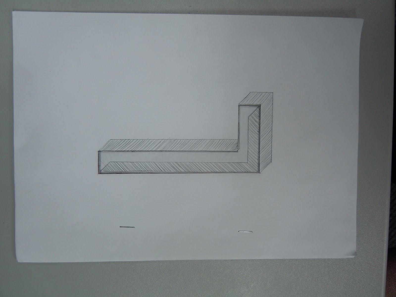
Photos of the type development
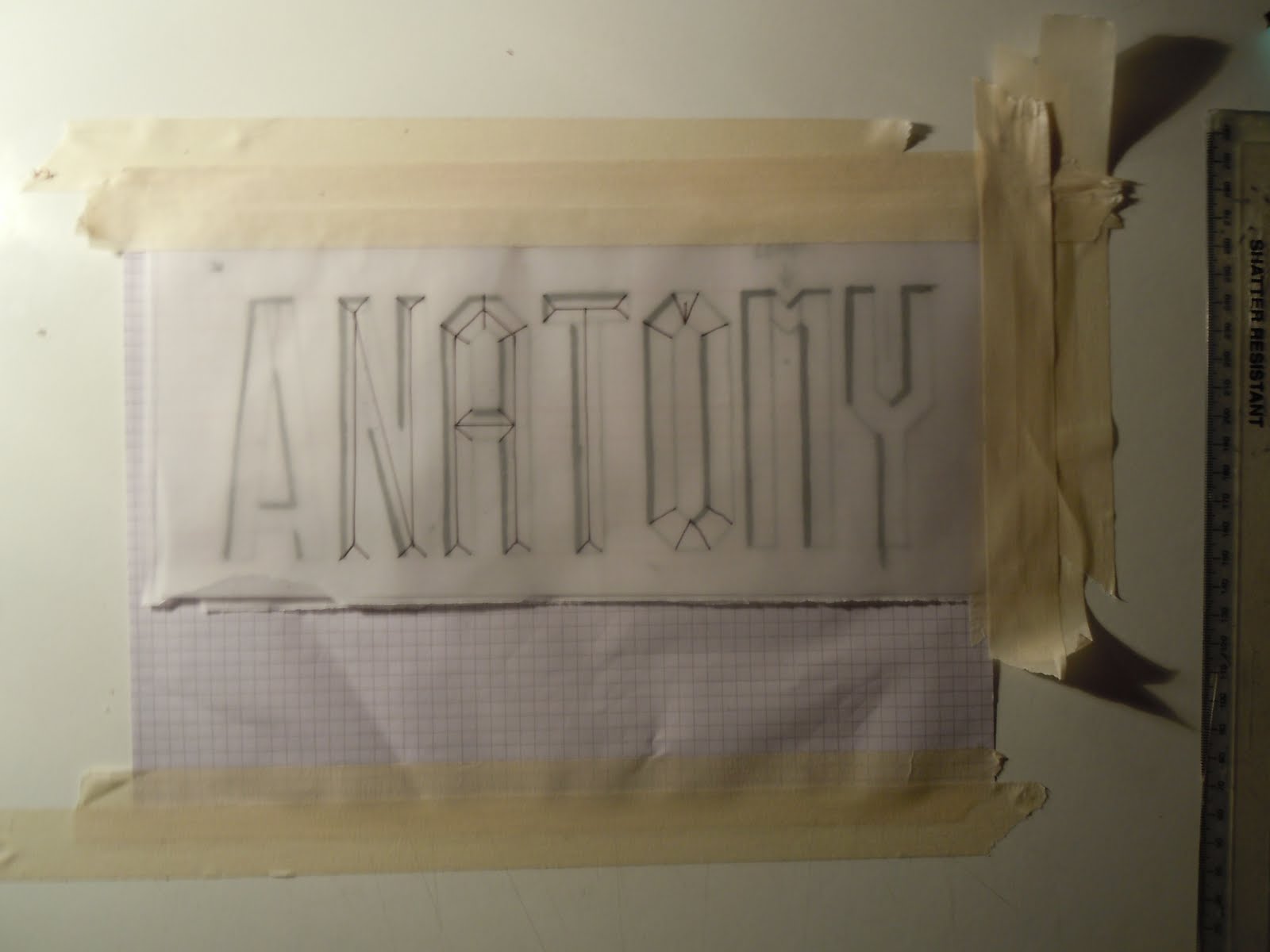
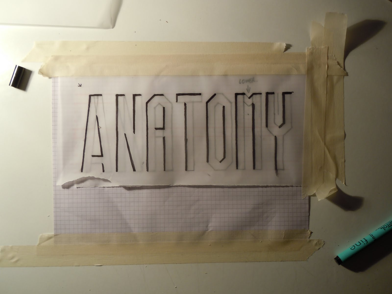
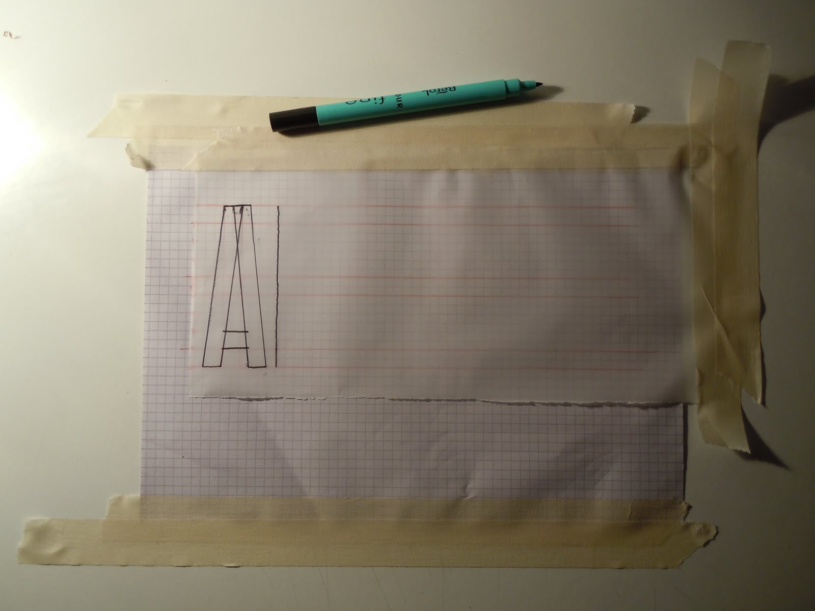
Working out the type layers to see what needs to go in order for the type to work successfully. I shall also mock up a Letter as a booklet to see whether or not the type will work. I still need to design the typeface, but I have an Idea of what I think reflects 2011.
Development - Type 2011
Type development. The layers of the family will be based on the human body layers. I have chosen this compared to naming the layers after a mountain structure because designers will be more familiar with the names and structure of the human body.
Tuesday 1 November 2011
Monday 31 October 2011


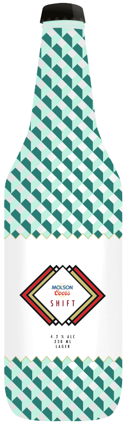
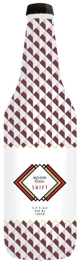
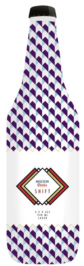
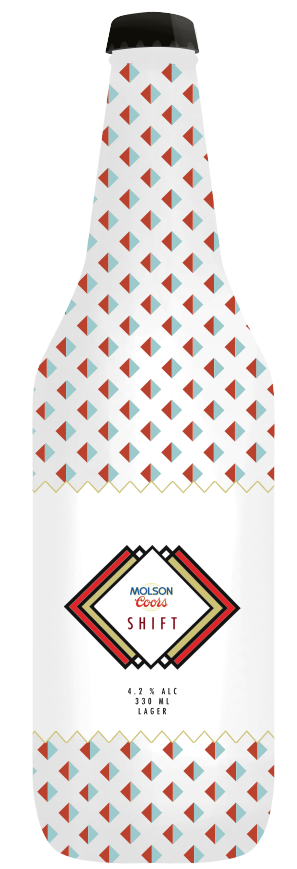
Final range of four bottles
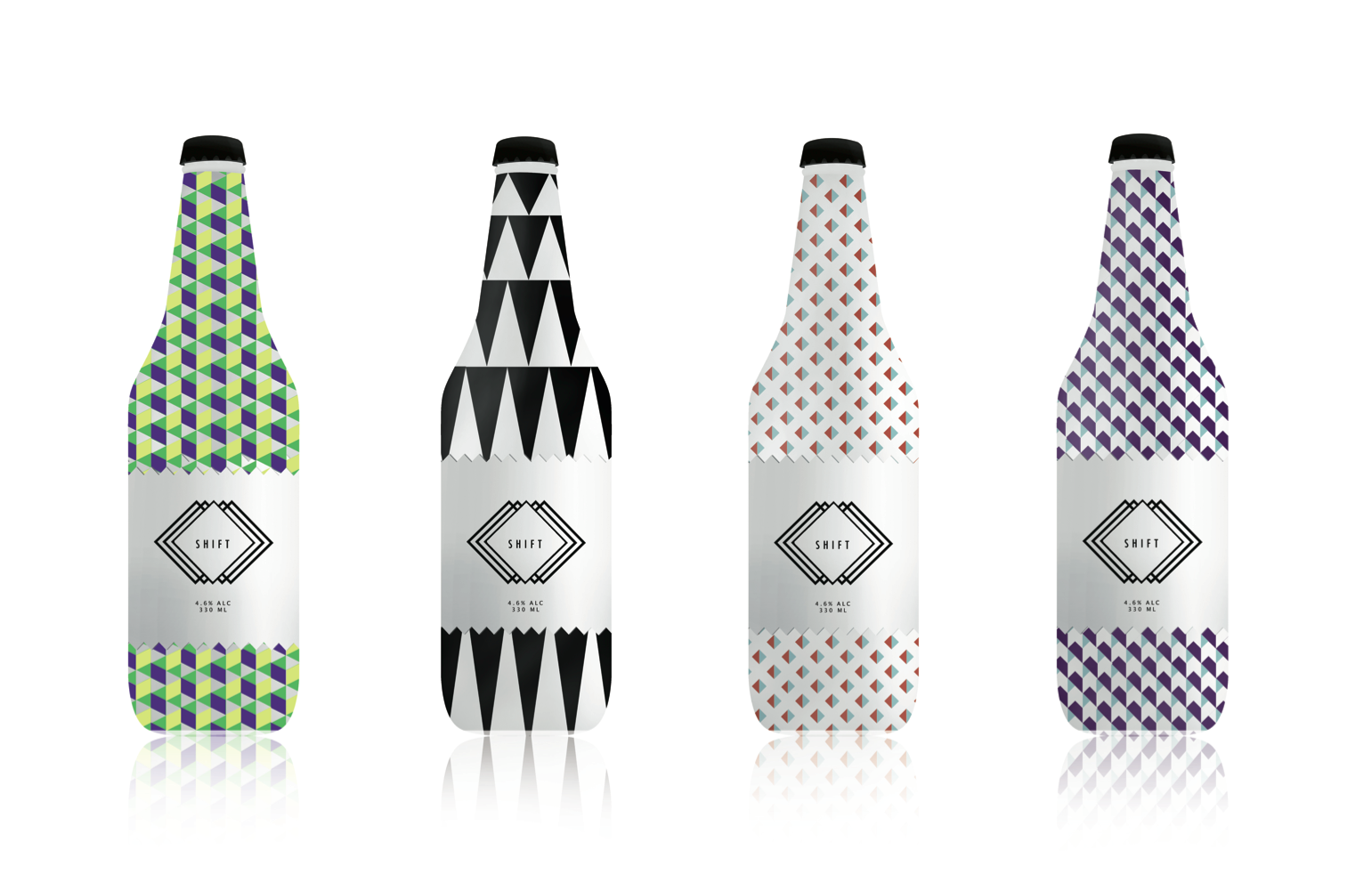
Final four bottles I have chosen to be the same product but a range of different designs. I think the bottles will need to be rendered better, to add more depth and give it a more alcoholic feel.
Bottle Development
Creating bottle wraps influenced by the female persona with the logo on. I think it is important not to make the bottle look and feel to masculine and not to feminine, if it was to masculine it would not solve the brief as there are already male targeted beers on the market and to feminine it would look too much and females would be to embarrassed to be seen with it.
Grid System - Fashion Patterns
The grid I have created will be used to design patterns based around the current female persona trends regarding shapes and colours.
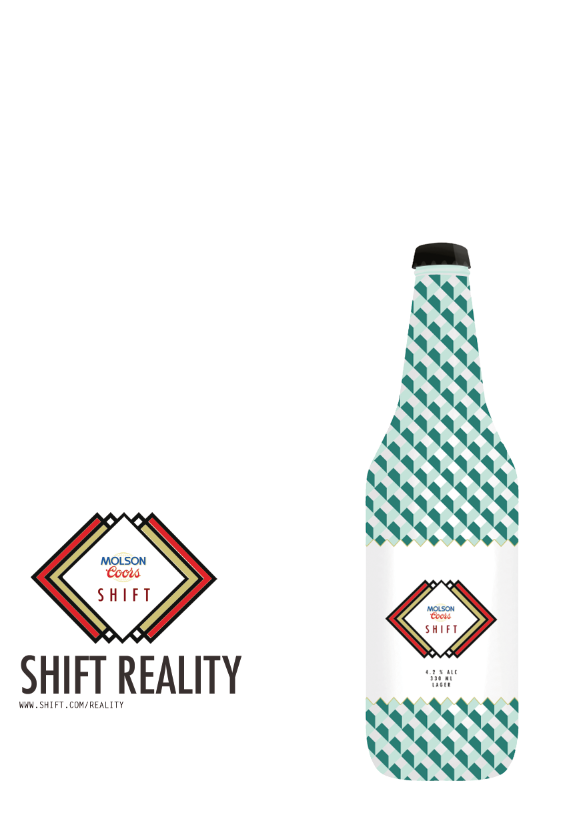
Final Logo
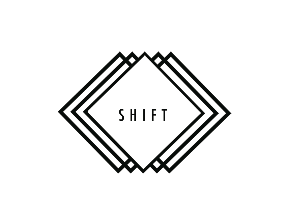
The final tweaked logo for Shift lager.
The logo represents the movement of the brand and the play on the language, shift power, attitude, perception. I think the bold squares guarding the word shift in the centre almost protects it and reflects the target audience as a safe product/ brand.
The typography is heavily influenced from the research into the female persona I am creating the brand for. Tall thin type
Logo Development.
Relating to the brand name SHIFT. The logo is based around the idea of movement but also using the bold shapes used relating to the female personas fashion patterns.
Graphic Language from T.A magazines
Dazed & confused
vortex
soul
your drink, your way
In havana - culture
When you cant find a party. You throw one.
Wove/n.
Rough & ready
feist
ol'
point
lost
equals
zips
hogan
dazed
shape & shift
shift
radical
entwined
cut & paste
wet & wild
all screwed up
vortex
soul
your drink, your way
In havana - culture
When you cant find a party. You throw one.
Wove/n.
Rough & ready
feist
ol'
point
lost
equals
zips
hogan
dazed
shape & shift
shift
radical
entwined
cut & paste
wet & wild
all screwed up
What makes the product unique?
Culture
flavour
calories
bitter
themed:
seasonal
festival
fashion
social drink
Look at , perfume packaging
PAPER London
Costa- Coffee
Lord of the files
WIlliam Golding
-Patterns
-Typography
-Language
-Colours
-Antique
-Penguin books
-YCN type
flavour
calories
bitter
themed:
seasonal
festival
fashion
social drink
Look at , perfume packaging
PAPER London
Costa- Coffee
Lord of the files
WIlliam Golding
-Patterns
-Typography
-Language
-Colours
-Antique
-Penguin books
-YCN type
Audience
Product modern, sleek
create a sense of culture
young- 18-25
festivals
umbrellas
tents, wellies
food? fruit
Social
Networking mobile
students
topshop , red magazine
music interest- alternative
to look different
drives/ cycles
what magazines does she like
looks after herself
well cultured
vintage
strong person
sophisticated
cautious, world & food
Finding an audience
What age range are more likely to drink beer
18-25
25-35
Young Parents
Mature audience set in wine and tea
Bottle-Message
What mood?
Persona Characteristics
Socialise
Internet
college/university
work
home
Fashion, whats in
Mobile - whats apps
small cars
work 9-5
local
friends
nights out
concerts
clubs bars
categories
news
stars
style
fashion
beauty
horoscopes
decamel
Moodboards
Audience
Compare two different subjects
Existing drinks
Trends
Promotional Campaigns for alcohol
VK, wine, Malibu, Ameretto, Bacardi
Opposite of Bitter
Compare two different subjects
Existing drinks
Trends
Promotional Campaigns for alcohol
VK, wine, Malibu, Ameretto, Bacardi
Opposite of Bitter
Audience
Women who buy alcohol
18-60 (big audience)
Why not buy beer?
Too masculine in the look and taste
what alcoholic beer would they like?
Language and trends present
Light ale - interact
Women taste bitter more than men
18-60 (big audience)
Why not buy beer?
Too masculine in the look and taste
what alcoholic beer would they like?
Language and trends present
Light ale - interact
Women taste bitter more than men
Problem
WHY IS THERE "A MASSIVE GAP IN THE MARKET, FOR BEER TO BE AIMED TO WOMEN"
If I can understand this then I will aim to create a response based on my findings.
If I can understand this then I will aim to create a response based on my findings.
Problem
What do women drink?
Why do they drink a certain drink?
What beers/ drinks are already targeted at Females? & How?
Are they successful, why?
What other products are consumed more by males & what alternatives are aimed at females? Shavers
When & where would the drink be consumed?
What category of drink would appeal to women? calories, flavour...
Is it a range of flavours, more than one product.
What products already exist at Molson Coors?
What person would the drink be aimed at?
How does the product engage the audience to the drink?
Distribution?
Market/ Promote?
What language is used- Audience?
Deliverables
-Invent a name for the brand/ campaign
-Logo
-Graphic Language
-Range... Website, Info packs
-What does the brand sound like?
-Interaction?
-Where would the product be aimed/ found?
Molson Coors
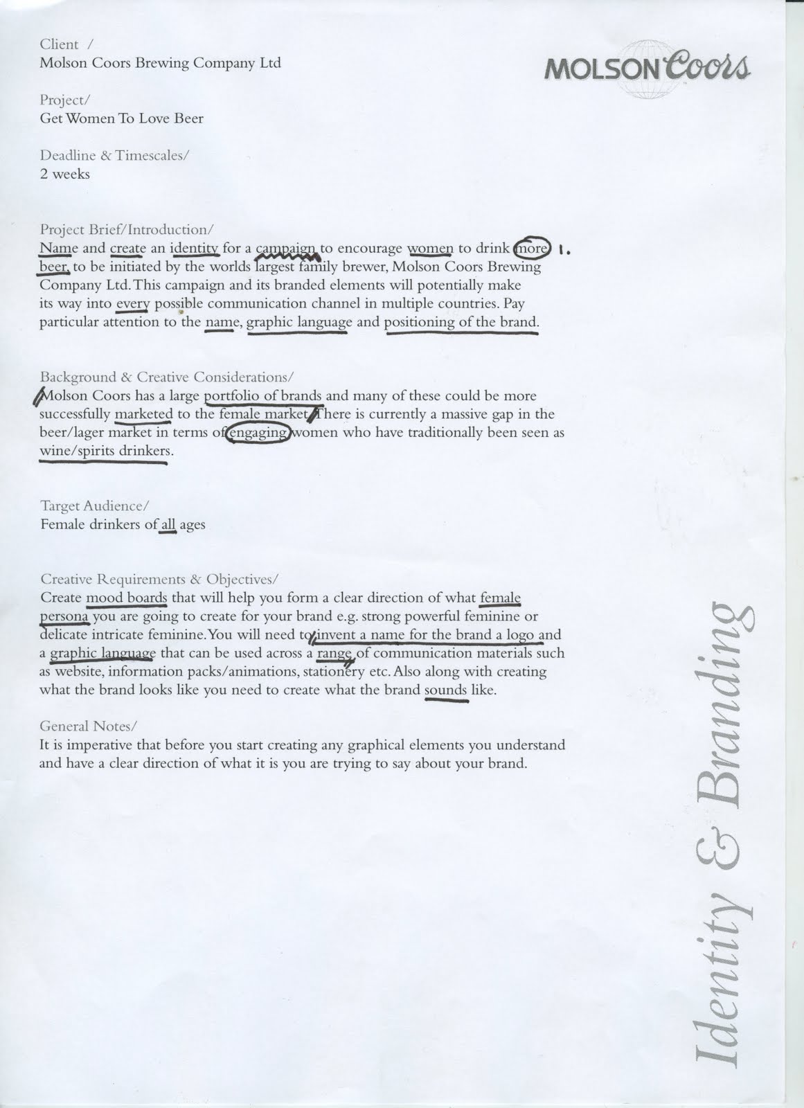
Brief
Name and create an identity for a campaign to encourage women to drink more beer
Background & Creative Considerations
There is a massive gap in the beer/lager market in terms of engaging women who have traditionally been seen as wine/spirit drinkers.
Target Audience
Female Drinkers of all ages
Requirements
Create moodboards to form a clear direction of what female persona you are going to create the brand for. Invent a name for the brand, a logo and a graphic language to be used across a range of different medias.
Thursday 20 October 2011
Distribution
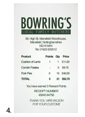
1. Ideal to order using the inmternet for collection in the same process as the iphone
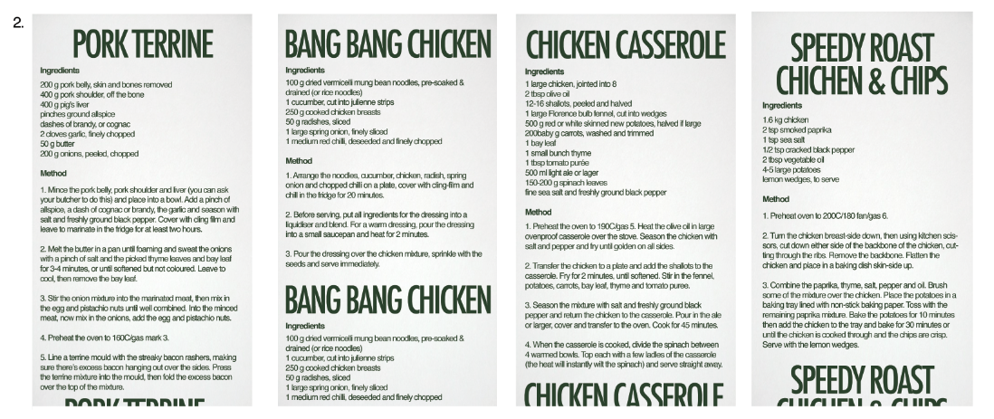
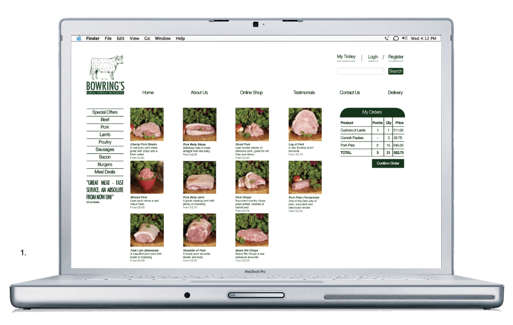
2. Four different backs of till rolls, with recipes on
3. Normal reciept for any customer
4. When an order is placed a reciept with the customers name is printed. This is good for organization but also adds that personal experience value which supermarkets cant do instore.
Order Process
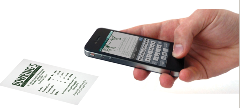
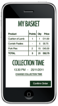
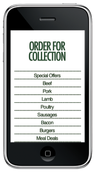
Mock up of an app for the butchers ideal to place orders within workers lunchtime for a collection at a spersific time. (after work when commuting through town on the way home)
One of the problems was the waiting times and closing times at local butchers vs supermarkets, this idea will make it easy to order and collect on the same everyday journey
travelling home.
When the order is placed the receipt will be printed at the butchers with the customers name on. This will be good for the user experience and makes it more personal, but also
helps organise the time frame for collection.
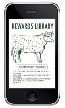
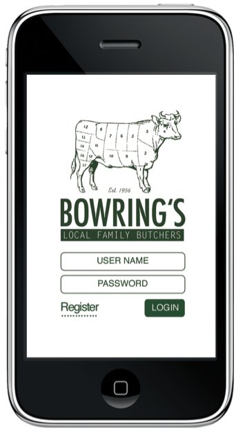
The app also has a Rewards Library where the user collects tockens when purchasing products which colour in the cow Logo part by part until enough parts are coloured to
claim a discount.
Subscribe to:
Posts (Atom)